The New Uniforms
Moderators: UAdevil, JMarkJohns

Re: The New Uniforms
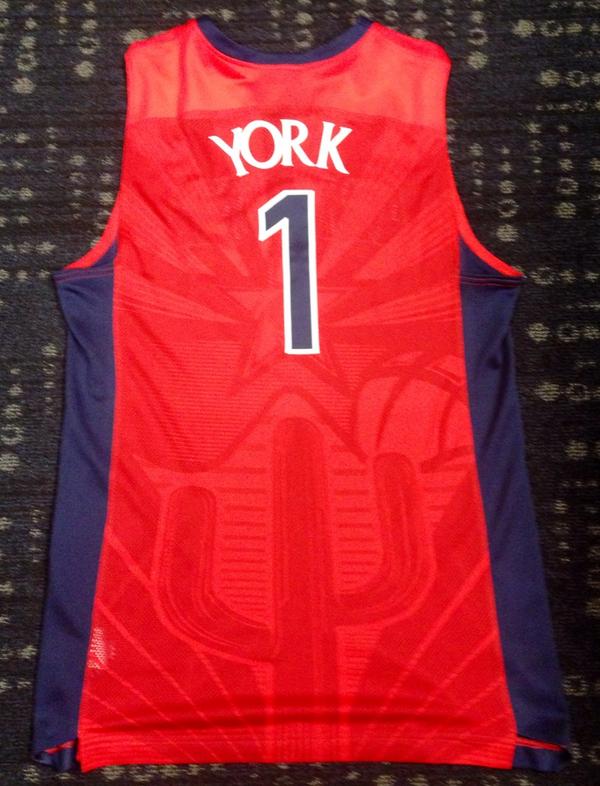
I like the cactus, but I think they should've changed the top of the design. You can barely see the star with the player's numbers covering it.
“The reality is that the hardest games to win are over teams on their home court. Teams that don’t play those games can spin it however they want, but what they’re saying is, ‘We don’t want to lose in our non conference season.’" - Sean Miller
-
Spaceman Spiff
- Posts: 14664
- Joined: Wed Jun 04, 2014 7:28 am
- Reputation: 1150
Re: The New Uniforms
So when the jersey's tucked in, it will create the illusion the sahuaro's rising directly from Rondae's buttcrack?Merkin wrote:Hate the awful 6th grade design. I would much rather have the old cactus design Lute favored.

-
PieceOfMeat
- Posts: 14080
- Joined: Thu Jun 05, 2014 9:14 pm
- Reputation: 337
Re: The New Uniforms
That would have been interesting to see, at least in mock-up form.Merkin wrote:Hate the awful 6th grade design. I would much rather have the old cactus design Lute favored.
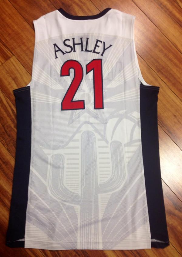
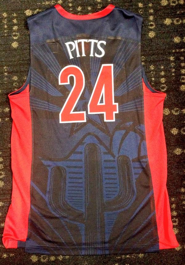
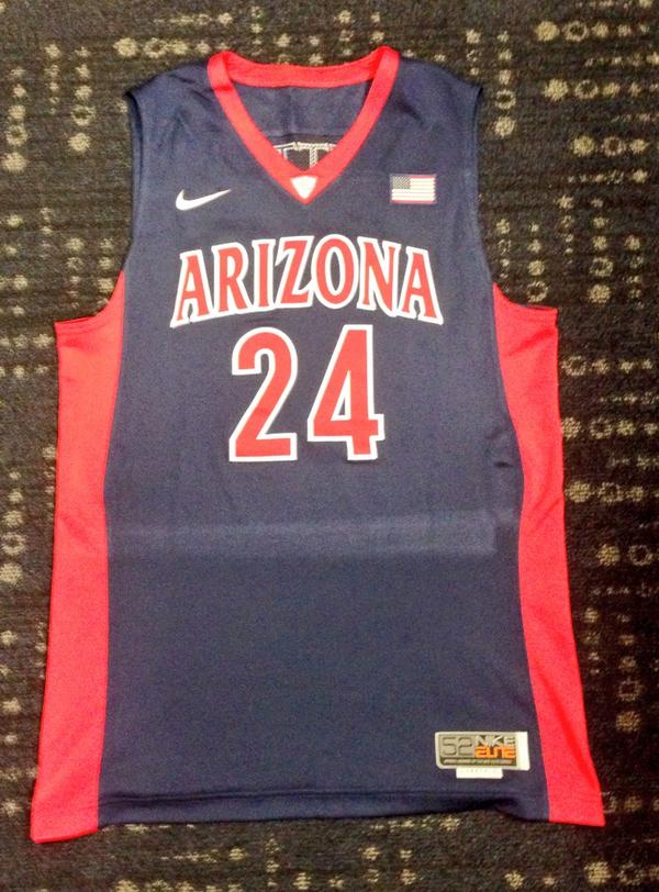
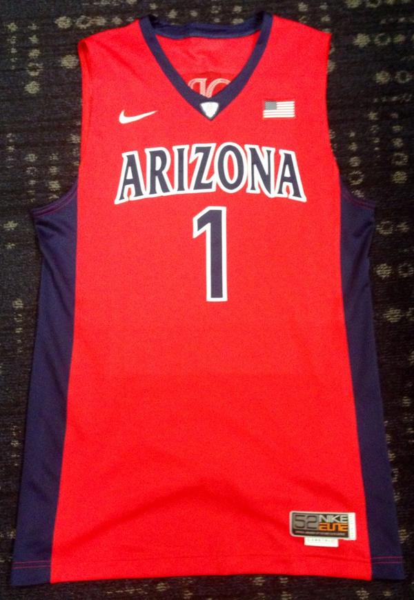
As much as I like the front/sides of the new unis...is as much as I dislike the back.
Have disliked that (as merk aptly puts it, 6th grade) design since it came out.
Still, overall, much improved, and no more duck tape on the shoulders, yay!
It's long past time to bring this back to the court, let's do it with a small update:


Re: The New Uniforms
that print on the back looks simply horrible, which is extremely disappointing considering how much I like the front.
I have to completely disagree about the print on the current (or at least the last few years) jerseys, that was much less gaudy and i thought it looked pretty cool.
I have to completely disagree about the print on the current (or at least the last few years) jerseys, that was much less gaudy and i thought it looked pretty cool.

Re: The New Uniforms
Wow, did not know the cactus design would be that dark and stand out that much. Not quite sure how I feel about it . Will wait to see how it looks on TV and with the other colors.

Re: The New Uniforms
All of those jerseys are photoshopped from the same jersey/short on the model.Reydituto wrote:azthrillhouse wrote:Is the 5th one grey? Not a huge fan of that, but otherwise.....awesome.
I assume the "skyline" shadow pattern on the back is gone?
I like them overall, sharp really, but I'm now convinced after some back and forth on Facebook that the 5th "gray" one on the right is actually a white one doctored in Photoshop to look "grey", as maybe they didn't have it at time of photo shoot. Either way, the "gray" looks redundant, and a bit silly - Never liked gray as a "neutral" - but whatever ...
Or they just managed to get the folds and creases exactly perfect on each shot.
I fly like a hawk, or better yet an eagle--a seagull. I sniff suckers out like a beagle...My ego is off and running and gone, Cause I'm about the best and if you diss than that's wrong

Re: The New Uniforms
PUKE does it!Coop Cat wrote:Wow, did not know the cactus design would be that dark and stand out that much. Not quite sure how I feel about it . Will wait to see how it looks on TV and with the other colors.
- Attachments
-
- FCOKZLAOYQDMBPI_20090222181638.jpg (19.56 KiB) Viewed 2774 times
Re: The New Uniforms
Just saying if a 6th grader did draw this they would be pretty damn talented! I do agree that old one is better!Merkin wrote:Hate the awful 6th grade design. I would much rather have the old cactus design Lute favored.

Re: The New Uniforms
You won't see it on tv. Not often at least. So nothing to worry about if you don't like it.Coop Cat wrote:Wow, did not know the cactus design would be that dark and stand out that much. Not quite sure how I feel about it . Will wait to see how it looks on TV and with the other colors.
i was going to put the ua/asu records here...but i forgot what they were.
i'll just go with fuck asu.
i'll just go with fuck asu.

Re: The New Uniforms
So much truth in that statement.Spaceman Spiff wrote:
I'm all about the pockets. Arizona game shorts are appropriate attire for 99% of Tucson events, and the remaining 1% I don't want to attend. Need a place for the keys, wallet and cell.
If a restaurant looks down on my U of A game shorts, that restaurant doesn't get my money.
Both of the current UA BBall shorts I have do have pockets, but both are due for replacement...one has a tear from my knee brace because I actually play basketball in them...go figure.
FWIW, I love the look of the new unis.

Re: The New Uniforms
Yea, compression shorts are needed if you are going to wear that new dri-fit material. I bought a pair of shorts that I only wore to the gym a few times and have since delegated to around the house wear. You can see junk swinging in those shorts from 100 yards awaySpaceman Spiff wrote: Nike has been a leader in the advancement of ultralight uniform materials that make it apparent for a several block radius when the wearer gets even the slightest hint of an erection.
I loved those jerseys until I saw the back of them. Still pretty nice though

Re: The New Uniforms
Once they have articulate legholes, they will.UofAlum05 wrote:Agree on the pockets. I love the newer ones I have that I can actually wear like regular shorts around town. But I still have a pair of the Blue ones from 2003 that I wear around the house, to bed, etc. Nothing is more classic and comfy. In 11 years of having those shorts the things those shorts have seen. Could you imagine if they could talk?dcZONAfan wrote:nah it's all good, just buy some more! Your current ones have got to be a little worn down at this point, right?Spaceman Spiff wrote:I kind of regret purchasing some shorts/jerseys given that I think this is a return to a long term look (at least hopefully) for us.
I plan on getting at least two pairs of authentic (probably blue and red) and, unlike most, hope that they do come with the pockets since I prefer to wear them around rather than play basketball in them (since I play like 1/month max). I love that the whites i got this year have pockets, comes in really handy when I want to be lazy but have to leave the house
I like these. Just hope the red is red and not orange/red. (See contrast between unis and the "A" on the floor).
Right where I want to be.

-
Spaceman Spiff
- Posts: 14664
- Joined: Wed Jun 04, 2014 7:28 am
- Reputation: 1150
Re: The New Uniforms
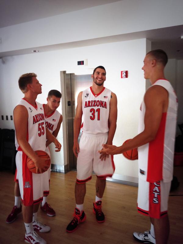
The home whites with blue stripes aren't the traditional, but I think I like them. The only thing is they remind me a little of Gonzaga's knockoffs of our uniforms.

Re: The New Uniforms
Last edited by NYCat on Wed Aug 27, 2014 8:05 pm, edited 1 time in total.
viewtopic.php?f=8&t=59&start=10200#p380285" target="_blank
-
Spaceman Spiff
- Posts: 14664
- Joined: Wed Jun 04, 2014 7:28 am
- Reputation: 1150
-
PieceOfMeat
- Posts: 14080
- Joined: Thu Jun 05, 2014 9:14 pm
- Reputation: 337
Re: The New Uniforms
Love the front, hate the back.
People tell me Lute's cactus was ugly....but I think that design is far worse.
People tell me Lute's cactus was ugly....but I think that design is far worse.
It's long past time to bring this back to the court, let's do it with a small update:
-
Main Event

- Posts: 2756
- Joined: Tue Jun 03, 2014 12:29 pm
- Reputation: 0
Re: The New Uniforms
The peoples champ JaKobe
Re: The New Uniforms
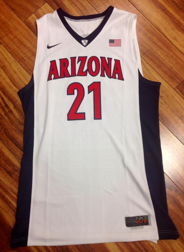
'Arizona' needs to be blue and/or 'cats', too much red - not enough contrast..
Last edited by NYCat on Wed Aug 27, 2014 3:13 pm, edited 1 time in total.
viewtopic.php?f=8&t=59&start=10200#p380285" target="_blank
Re: The New Uniforms
Looks Red/Orange may be the filter
Re: The New Uniforms
I guess white/red are the defaults
viewtopic.php?f=8&t=59&start=10200#p380285" target="_blank
-
Merkin

- Posts: 41414
- Joined: Tue Jun 03, 2014 10:31 am
- Reputation: 1358
- Location: UA basketball smells like....victory
Re: The New Uniforms
Sorry, nope, not a fan of the "art" work. Just way too busy and amateurish.
and what's with "Arizona" being reversed? Is it bleeding through from the front?
and what's with "Arizona" being reversed? Is it bleeding through from the front?
Re: The New Uniforms
Agree, they look too plain & generic to me although they are still an upgrade to our recent uni's.NYCat wrote:'Arizona' needs to be blue and/or 'cats', too much red - not enough contrast..
Re: The New Uniforms
In that Stanley photo the horrible Instagram filter makes it (design) looks even worse.
Looks more understated here.

More pics..
Looks more understated here.
More pics..
Last edited by NYCat on Wed Aug 27, 2014 8:14 pm, edited 3 times in total.
viewtopic.php?f=8&t=59&start=10200#p380285" target="_blank

Re: The New Uniforms
TJ dye his hair? Zeus looks stronger
Re: The New Uniforms
tj's hair is just longer. he had it buzzed to the skull before, just looks like he let it grow out a half inch.
i was going to put the ua/asu records here...but i forgot what they were.
i'll just go with fuck asu.
i'll just go with fuck asu.
-
Bsktball Is Neat
- Posts: 5
- Joined: Mon Jun 09, 2014 1:52 pm
- Reputation: 0
Re: The New Uniforms
Good effort on the uniforms, but those red/whites look like something St. John's would wear. The "Arizona" on the front should be blue. That's how it was back in the day. I think the grey alternates got it correct...red sides and collar with blue letters. Also, in my humble opinion, the shorts would be better if they had 'cats on both sides. I think in '98 or '99 they switched and put 'cats on both sides. Before that, the sides of the shorts were similar to the current ones.
Oh well. Just get to the Final Four and I could care less what they wear.
Oh well. Just get to the Final Four and I could care less what they wear.
-
Bsktball Is Neat
- Posts: 5
- Joined: Mon Jun 09, 2014 1:52 pm
- Reputation: 0
Re: The New Uniforms
Note sides of shorts here:

Versus here:

Re: The New Uniforms
The white/blue combo is the best option for home.
The Gray is awful.
The Gray is awful.
I fly like a hawk, or better yet an eagle--a seagull. I sniff suckers out like a beagle...My ego is off and running and gone, Cause I'm about the best and if you diss than that's wrong
Re: The New Uniforms
Old vs new just for shits and jiggles!
Last edited by 3goggles on Mon Oct 06, 2014 3:47 pm, edited 1 time in total.
Re: The New Uniforms
How they look on Video:
viewtopic.php?f=8&t=59&start=10200#p380285" target="_blank
-
Spaceman Spiff
- Posts: 14664
- Joined: Wed Jun 04, 2014 7:28 am
- Reputation: 1150
Re: The New Uniforms
I agree on whit/blue being the best. Gray isn't awful as a one or two times a year thing. They are all a massive step up from where we've been and a needed return to the glory days while maintaining an updated feel.Olsondogg wrote:The white/blue combo is the best option for home.
The Gray is awful.
Re: The New Uniforms
I wish they would use logo with the "A" inside the ball instead of just the block A. In my opinion that is one of the best logos in sports.
Re: The New Uniforms
So the shorts are pretty much see through...
-
Longhorned

- Posts: 14758
- Joined: Tue Jun 03, 2014 1:04 pm
- Reputation: 975
- Location: In a guayabera at The Sands Club, Arizona Stadium
Re: The New Uniforms
With all due respect to your opinions, I think I speak with a little more authority than others here on account of having better taste than you all. These uniforms are first class.
The watermark on the back is just a watermark -- it doesn't register as something for the live fans or the TV viewers to see.
The shorts aren't see-through. It's just that you can see the white material more when it doubles up.
These relate to the classic old uniforms we love in the same way that the Lakers' update 10 years ago or so relates to the classic Lakers uniforms. You're going to love these as time moves forward.
-
Spaceman Spiff
- Posts: 14664
- Joined: Wed Jun 04, 2014 7:28 am
- Reputation: 1150
Re: The New Uniforms
The classic Lakers uniforms are much better than the current. I hope I like our jerseys more than that.Longhorned wrote:With all due respect to your opinions, I think I speak with a little more authority than others here on account of having better taste than you all. These uniforms are first class.
The watermark on the back is just a watermark -- it doesn't register as something for the live fans or the TV viewers to see.
The shorts aren't see-through. It's just that you can see the white material more when it doubles up.
These relate to the classic old uniforms we love in the same way that the Lakers' update 10 years ago or so relates to the classic Lakers uniforms. You're going to love these as time moves forward.
Also, potentially see through shorts would yield a competitive advantage. Imagine how it would mess with opponents heads if they were continually unsure if they were looking at a shadow on the outside of the shorts or a penis within them.
-
Longhorned
- Posts: 14758
- Joined: Tue Jun 03, 2014 1:04 pm
- Reputation: 975
- Location: In a guayabera at The Sands Club, Arizona Stadium
Re: The New Uniforms
"Is that a ... NOOOOOO! Can't be. Can it?"Spaceman Spiff wrote:The classic Lakers uniforms are much better than the current. I hope I like our jerseys more than that.Longhorned wrote:With all due respect to your opinions, I think I speak with a little more authority than others here on account of having better taste than you all. These uniforms are first class.
The watermark on the back is just a watermark -- it doesn't register as something for the live fans or the TV viewers to see.
The shorts aren't see-through. It's just that you can see the white material more when it doubles up.
These relate to the classic old uniforms we love in the same way that the Lakers' update 10 years ago or so relates to the classic Lakers uniforms. You're going to love these as time moves forward.
Also, potentially see through shorts would yield a competitive advantage. Imagine how it would mess with opponents heads if they were continually unsure if they were looking at a shadow on the outside of the shorts or a penis within them.
Of course, this wasn't needed when we had Hassan:

Re: The New Uniforms
Jersey tag shows through...
Re: The New Uniforms
Last edited by NYCat on Tue Sep 16, 2014 8:52 am, edited 1 time in total.
viewtopic.php?f=8&t=59&start=10200#p380285" target="_blank
Re: The New Uniforms
^^^^^ Put some white trim on the sides there and those are fire. Need something to break up all that red/blue.
Re: The New Uniforms
These are freaking SICK!NYCat wrote:
Re: The New Uniforms
Both are superior.Bsktball Is Neat wrote:
Note sides of shorts here:
Versus here:
Right where I want to be.
Re: The New Uniforms
Yeah we all think so but that is not going to happen so this is the next best thing!gumby wrote:Both are superior.Bsktball Is Neat wrote:
Note sides of shorts here:
Versus here:
Re: The New Uniforms
Dark ones are better than white ones (bland). All are an improvement. We can't have them because nobody would buy them? Or is there some legal reason?
Right where I want to be.
Re: The New Uniforms
They seem to go against nikes template and current vision of what uniforms should look like. I think it is as close to 90's to 2000's sets! All in all I am happy with them.gumby wrote:Dark ones are better than white ones (bland). All are an improvement. We can't have them because nobody would buy them? Or is there some legal reason?
-
Longhorned
- Posts: 14758
- Joined: Tue Jun 03, 2014 1:04 pm
- Reputation: 975
- Location: In a guayabera at The Sands Club, Arizona Stadium
Re: The New Uniforms
I agree with the less-than-favorable comparison to the 90s-early 2000s uniforms, but keep in mind that these new photos are overly saturated to bring out the watermark, which otherwise is hardly visible. The navy is like the regular navy, and the red isn't as psycho killer red as the pics suggest.
Re: The New Uniforms
I think they would be the best uniform combo if they weren't gray, the white/red needs more blue to contrast. The white/blues look really good as well.
The one good things about the gray's is its really light shade of gray, it almost looks white.
The one good things about the gray's is its really light shade of gray, it almost looks white.
viewtopic.php?f=8&t=59&start=10200#p380285" target="_blank
Re: The New Uniforms
I really wish the 5th set they wouldve done a throwback to sage and silver or the 80's or hell even a set with copper. Call me a LOON I know!